Data + Design
Turning complex datasets into something a person can act on. Two decades of making data legible: dashboards leaders actually use, and a chart type invented because the existing ones were not telling the truth.
The through-line
Clarity is the whole job
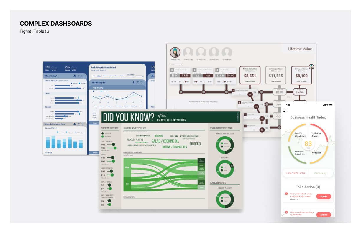
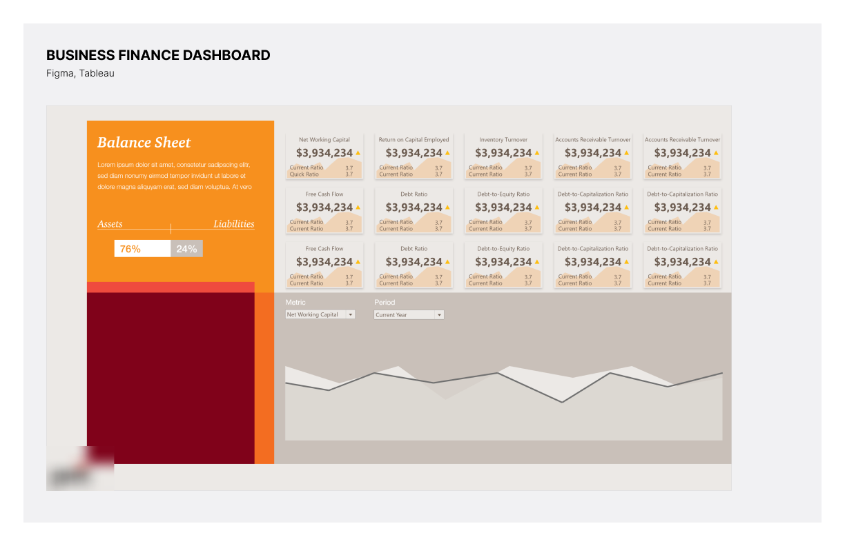
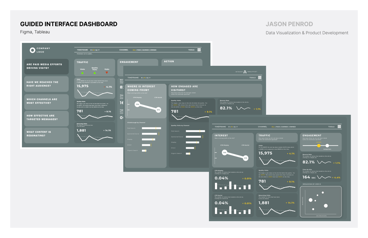
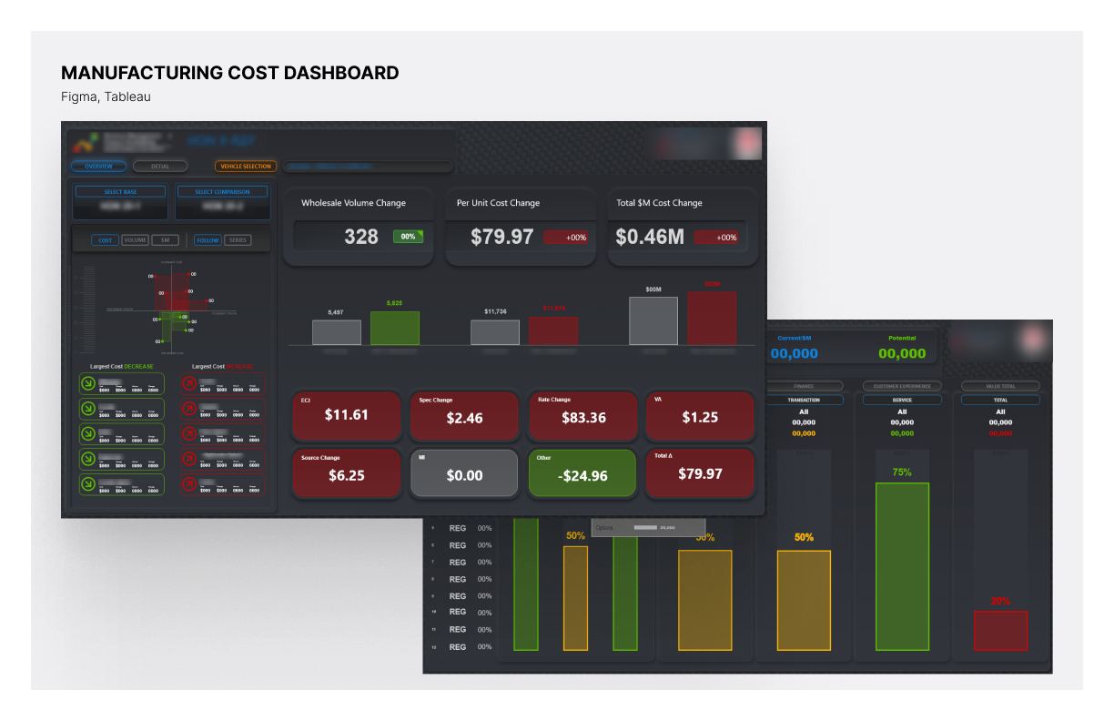
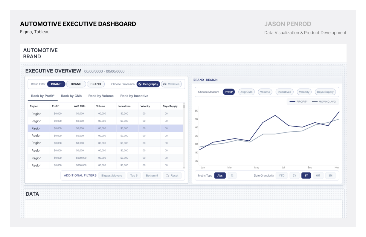
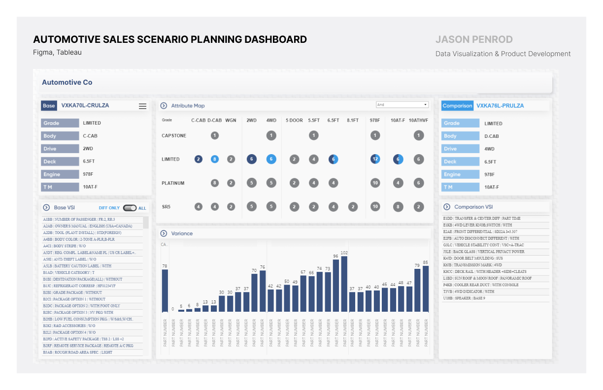
My design philosophy is clarity and function: users should navigate and interact with data without effort. I turn complex datasets into actionable insight, using charts, graphs, and custom dashboards to make a trend obvious in a glance. The work is not prettier dashboards. It is clearer, more usable, more scalable ones.
Invented form
The Leapfrog Chart
A Fortune 10 automotive client needed dealerships to compete with each other. The existing forms could rank them, but ranking tells a dealer they are seventh. It does not tell them what seventh costs, or how far they are from sixth. The chart had to answer the only question the dealer actually has: what would it take to pass the car in front of me?
So we built one. A minimalist dot plot carries every dealer in the group. One is the focus. A bar connects that dealer to the comparison point, the group average, and it is coloured by direction, so the gap is not inferred from position, it is drawn. The bar is the answer. Its length is the work required, in the unit the dealer is measured in.
It became the company's strategic differentiator and the origin of its design practice. Its published introduction, written by founder Ryan Sleeper, credits it as “developed in conjunction with Playfair Data Information Designer, Jason Penrod.”
Read left to right, the focus dealer trails the group for five months and the bars run red. In June it passes, and every bar after it turns green. That crossing is the whole point, and it is the reason for the name.
Have a dataset nobody can read?
That is the work. Tell me what decision the data needs to support, and I will show you what to build.
Start the conversation